A UX-driven Branding Process Helped Change Perceptions about Atlantic City
Challenge
Atlantic City was one once celebrated as “America’s Playground” where celebrities like Frank Sinatra vacationed. But over time, the destination became more closely associated with gambling, outdated infrastructure, and safety concerns. Our challenge was to shift this perception to showcase the city’s assets beyond casinos and reposition it as a multifaceted destination for leisure travelers, event planners, and residents alike.
Role
Design Lead: strategy, stakeholder presentations, design execution, copywriting
Objectives
Shift public perception by controlling the city’s visual, verbal, and emotional narrative
Reframe the brand to reflect the city’s strengths beyond casinos
Support meetings and events tourism
Ground the identity in visitor insights and data
Key Outcomes
64.3% boost in positive perception of Atlantic City as a business destination
60.6% increase in meeting planners sourcing AC for an event
91% YOY increase in website traffic
Client signed a second 3-year contract of $1.8m
Quantitative & qualitative user research was conducted to uncover current perceptions of Atlantic City
We conducted 17 focus groups and over 1,000 surveys with four key audiences: meeting planners, leisure travelers, local residents, and stakeholders.
Strengths identified: oceanfront location, walkability, dining, live entertainment, arts and culture, family-friendly attractions.
Weaknesses identified: safety, cleanliness, lack of awareness of non-casino options, airport accessibility.
These insights revealed a clear opportunity: to spotlight Atlantic City’s underrepresented strengths and address perception gaps directly.

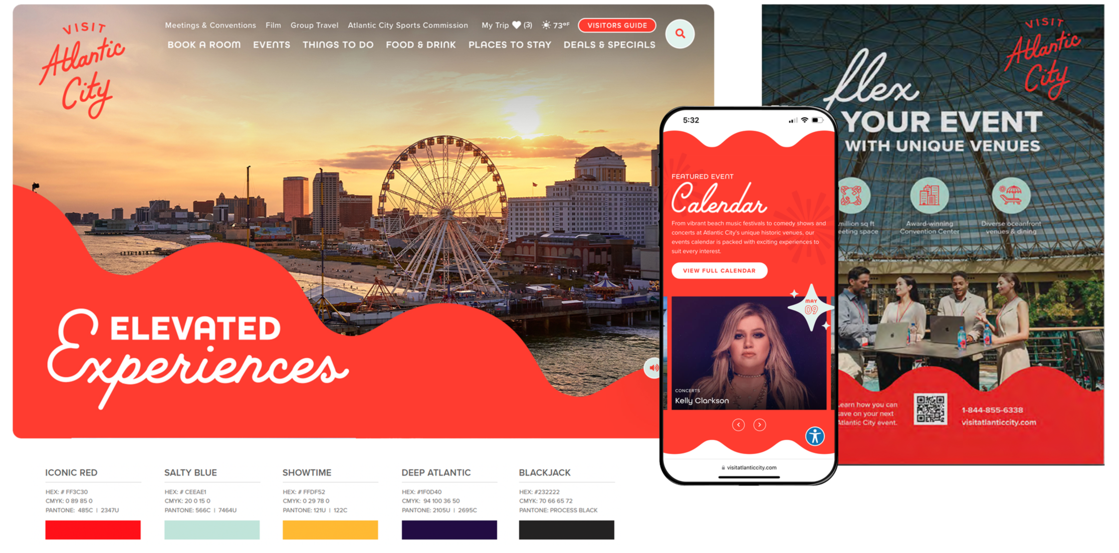
Click images to enlarge
The rebrand centered around telling a new story, one rooted in vibrancy, inclusivity, and variety:
Visual Direction: Bold, colorful design language that conveys energy and diversity.
Messaging: Balance between leisure (“beaches, food, nightlife”) and professional value (“a place where meetings thrive”).
Tone: Optimistic and welcoming, designed to counteract negative preconceptions.
Applications: Website redesign, marketing collateral, event campaigns, and citywide touchpoints.
The brand also emphasized how leisure offerings - dining, arts, entertainment - enhance corporate events by boosting attendee satisfaction and connection.
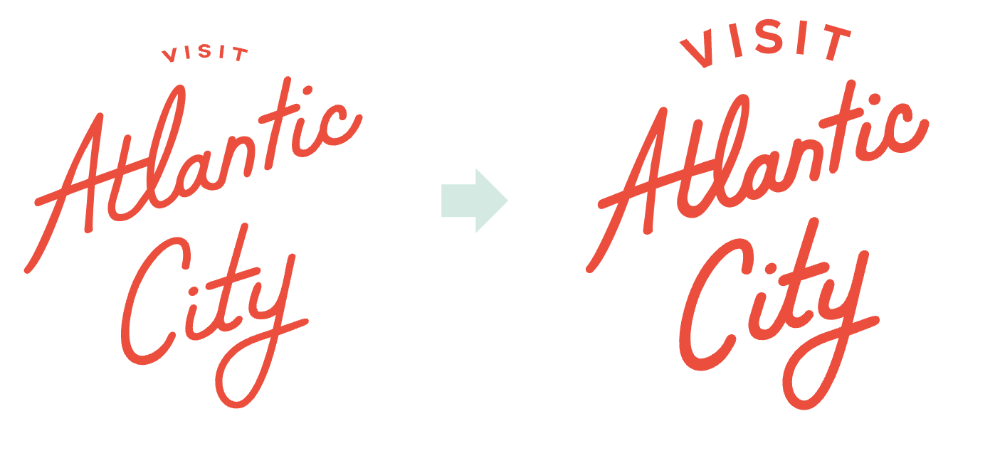
User Testing unveiled positive reactions, the need for diversity in photography and increasing logo’s readability
User testing was conducted with both meeting planners and leisure travelers. In total, 310 fully completed surveys were collected in this effort from meeting & event planners from around the country. While short video reactions and surveys were collected for leisure travelers.
Click images to enlarge
Impact
64.3% increase in receptivity that AC is a place for business
60.6% increase in meeting planners sourcing AC for an event
91% YOY increase in website traffic
Client signed a second 3-year contract of $1.8m in 2025

dotComm Awards, Gold: Visit Atlantic City, Branding