Challenge
Las Vegas is the world’s #1 meetings destination. But in 2023, event and meeting bookings were declining. The goal? Prioritize getting users to contact the team, since direct contact triples the likelihood of booking compared to standard RFP submissions.
Role
UX Design Lead: UX strategy, UI direction, stakeholder presentations, and project management
Visit Las Vegas - A website redesign increased event booking leads by 60%

Discovery & Research
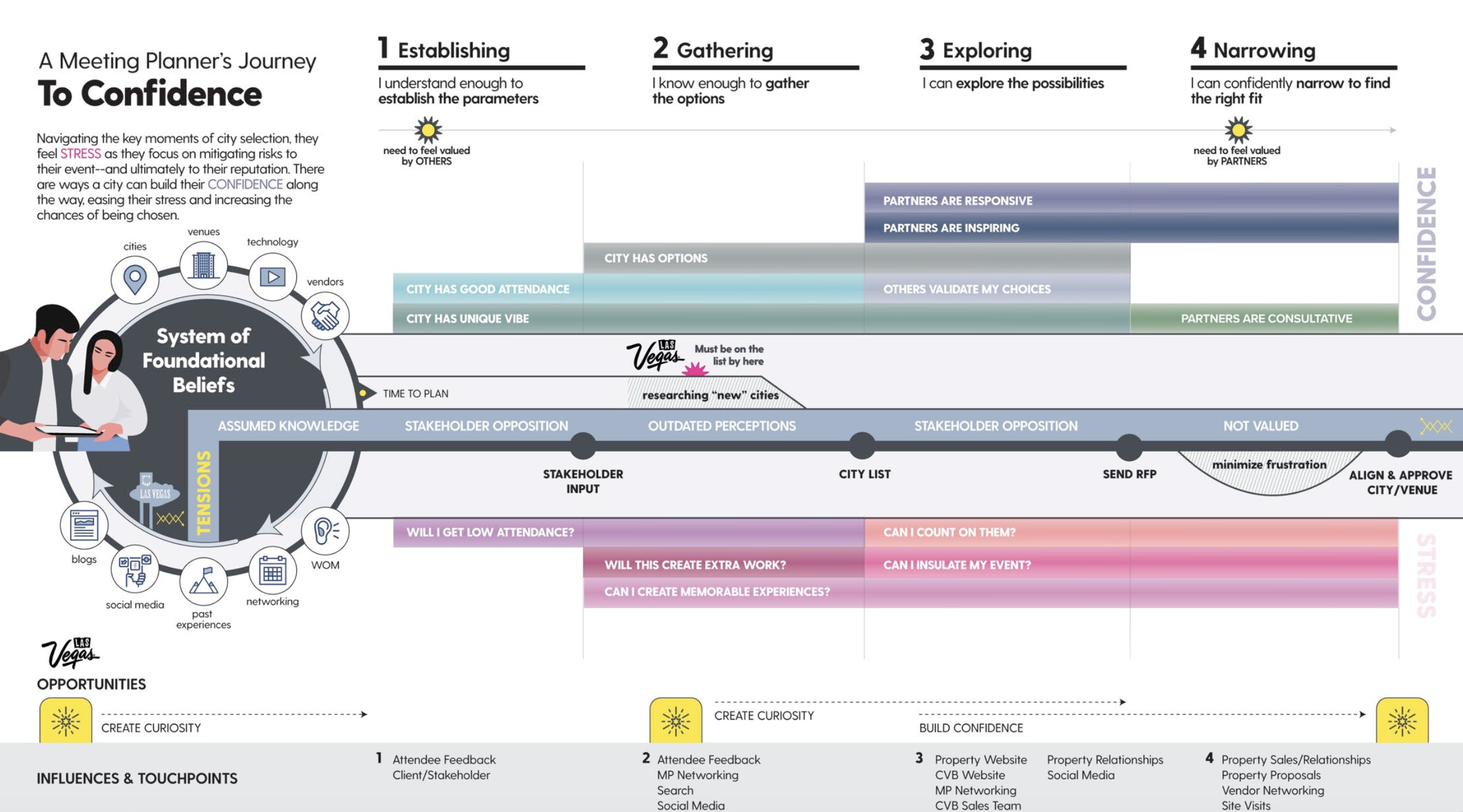
Solving the problem started with dissecting the Event Planner user journey
Secondary research mapped out the Meeting Planner’s journey in selecting a destination for their event, identifying key points where they are most likely to seek information or engage with a team member. The four stages of the Meeting Planner’s destination and venue selection process are as follows:
1. Establishing. “I understand enough to establish the parameters.”
2. Gathering. “I know enough to gather the options.”
3. Exploring. “I can explore the possibilities.”
4. Narrowing. “I can confidently narrow to find the right fit.”
I identified and broke down the key points (stages 3 & 4 below) in the user journey where they are most likely to seek information or engage with a team member. I made sure to focus on the information the users needed at these stages and plant strategic placements of getting in touch with the Vegas team as well as resources they will need from Vegas team members.
User Research Insights
Where do the lead gen CTAs sit in the site structure and UI?
The website needed to provide comprehensive information across all pages to support every stage of the meeting planner’s journey. This included details on venue spaces, incentives, hotel bookings, and off-site activities for attendees. But stages 3 and 4 were critical, as they marked the points where the website and team member interactions occurred.
To accomplish boosting the the booking lead, the website required:
Strategic call-to-action placements in key locations to encourage team contact.
Seamless contact: Reaching out to a team member had to be effortless, with no barriers.
Easy filtering: Users needed to quickly find the correct team member for their specific event type.
Personalized engagement: Team members needed to be presented as approachable and personable, encouraging meeting planners to connect with them.
Design Ideations
Strategic messaging, color and key locations for the call to action
In collaboration with Sr. Designer Becca Bratt, we identified every possible location and page across the sitemap that a “Contact the Team” call to action made sense to help drive a conversion. We eliminated some possibilities and also ideated on widgets that could be flexible and used modularly across the site.
We determined that in every instance that allowed, the call to action had to…
Use color strategy - designate a single color (blue) that would be used for all top KPIs
Contain inviting messaging, ie “We would love to speak with you” rather than the go-to “Contact Us” call-to-action
Display a photo of a team member so that the user could put a friendly face to the team they are contacting
CTA placement in navigation take over
If a user is already looking for information, the one place they will definitely access is the site’s main navigation. This key location, along with using the brand blue strategically to guide the user’s eye to the right side of the screen, increased the likelihood of visibility for conversion on this KPI. In addition to color strategy, we made sure to personalize the language to help increase engagement. For example, in instances that allowed for more copy, messaging such as “Have Questions? We’d love to speak with you directly” was used to be more inviting to encourage interaction.

Bridged the gap between venue pages and contacting the venue’s designated team member.
Placed personalized team members contacts onto their respective venue pages (vs only having the team members on an About The Team page in a separate location.)
Created droppable, modular contacts widget that can be placed on any page
Enforced ease of discoverability and usability for user

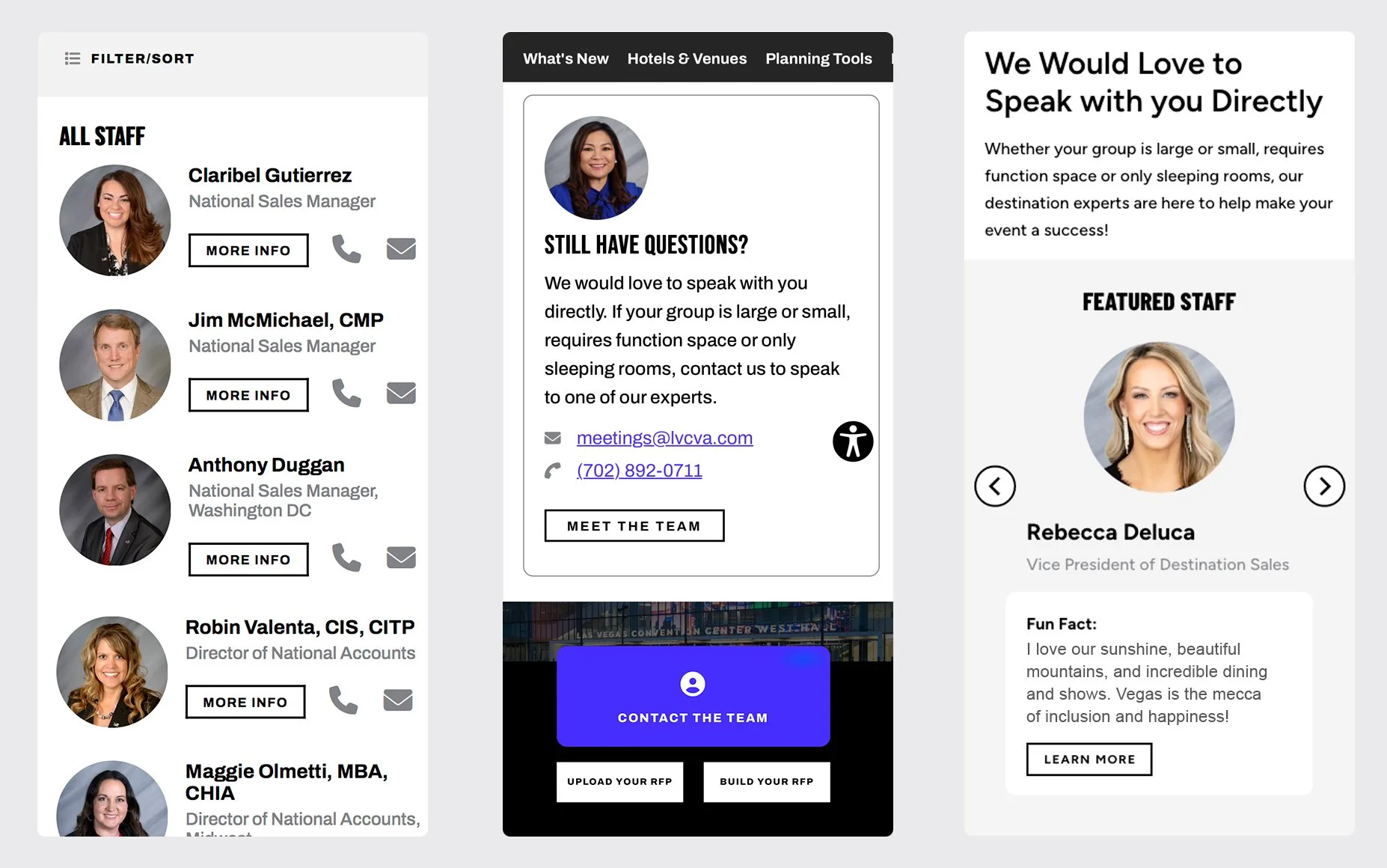
Personalized widgets to encourage engagement
Sliders and widgets that offer the opportunity to represent the team members in an approachable and personalized way with fun imagery and quotes that detail what they love about Vegas
Encourages users to connect with Vegas team members

The Vegas team is robust - how can a user easily find the team member they need?
An easy way for a planner to find which team member they needed to contact by filtering by industry and sales region. The Visit Las Vegas sales team is very robust with multiple departments based on industry and location. A meeting planner has the option of over two dozen Las Vegas team members to decipher and choose from. In collaboration with our lead developers, we created a comprehensive contacts list that is filterable by industry, type of event, and geographical location. It also offers pop up for bio and contact info.
User testing
User testing showed that the planned sticky CTA button was mistaken for a chatbot.
A sticky button was planned to sit directly under the sticky menu button. This was intended as another prominent opportunity for a user to contact the team by clicking the button and heading to the comprehensive team page. However, 100% of users tested thought this was a chat bot due to the speech bubble icon and it’s sticky placement on the right side of the screen. We ended up removing the button and instead provided the modular widgets that can be flexible and placed on any page.

Results
The optimized strategies and placements effectively boosted the top KPI of contacting the team, leading to a 60% increase in user inquiries via phone or email in one year from launch.
40%+ increase in the team being contacted by email.
20% increase in the team being contacted by phone.

dotComm Awards, Gold: Las Vegas Convention and Visitors Authority, B2B Website