CMS UI Kit- Increasing Design Efficiency by 30% with a Scalable Design System
Challenge
The goal was to decrease time from project start to launch, especially for our core website product
Design workflows were inconsistent, resulting in duplicated effort and unclear standards
Teams lacked a unified knowledge of UX best practices, causing inconsistent solutions
Lack of a shared design language led to misalignment between design, PM and dev teams
Role
UX Design Lead - design execution, stakeholder partnership
Creating the Design System
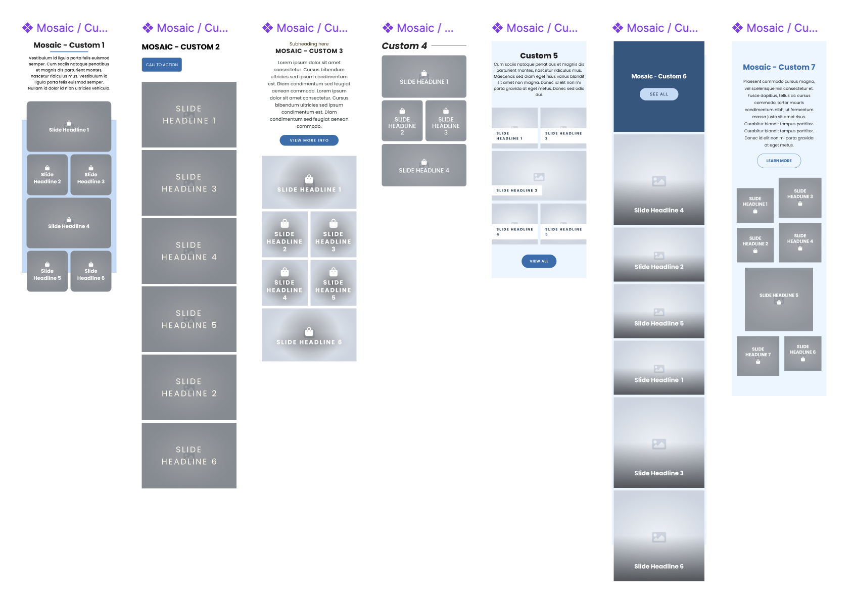
The design system needed to focus on scalability and flexibility in order to be leveraged for all clients.
The UI styling and content will be applied based on client brand and KPIs and overall strategic goals so the style needed to focus on ease of use for designers to update efficiently and effectively.
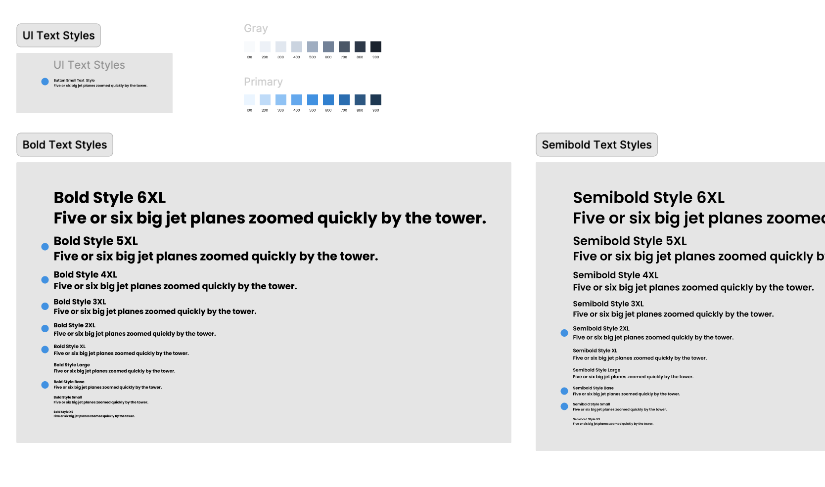
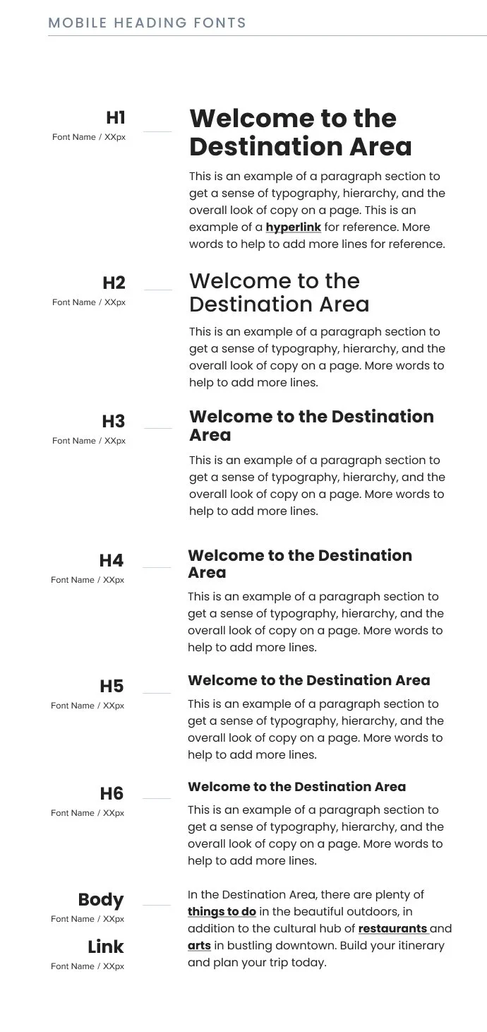
Typography & Styles:
Defined scalable heading/body styles for web & mobile
Applied WCAG contrast standards for inclusive readability
Color & Spacing System:
Color scales that could be easy adoptable and editable for the client’s brand
Implemented color accessibility components to check color contrast
Spacing scale & 8-point grid for layout consistency.
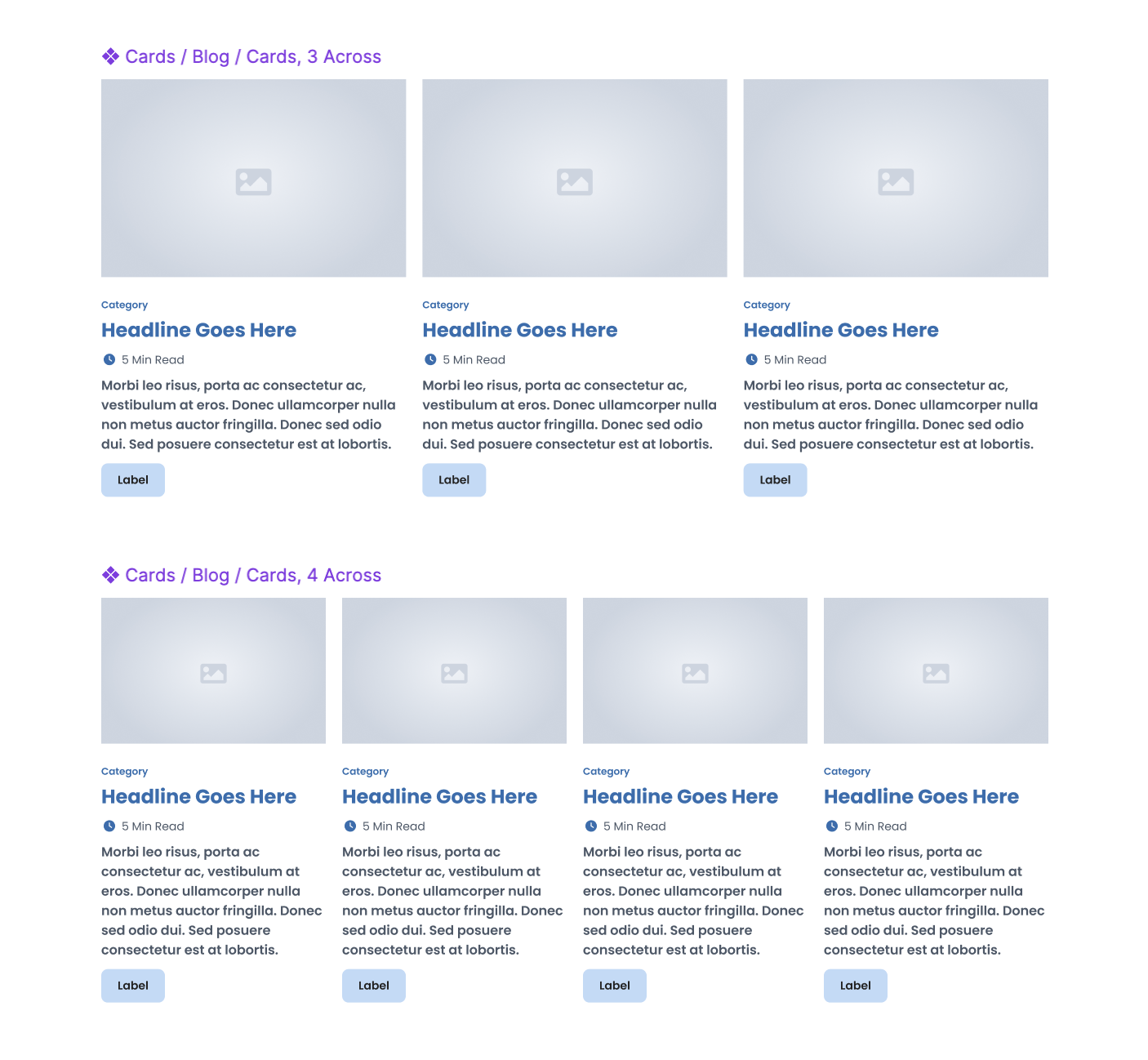
UI Components:
Buttons, navigation bars, cards, form inputs, icons
Documented hover/active/disabled states
Responsive variants for different breakpoints


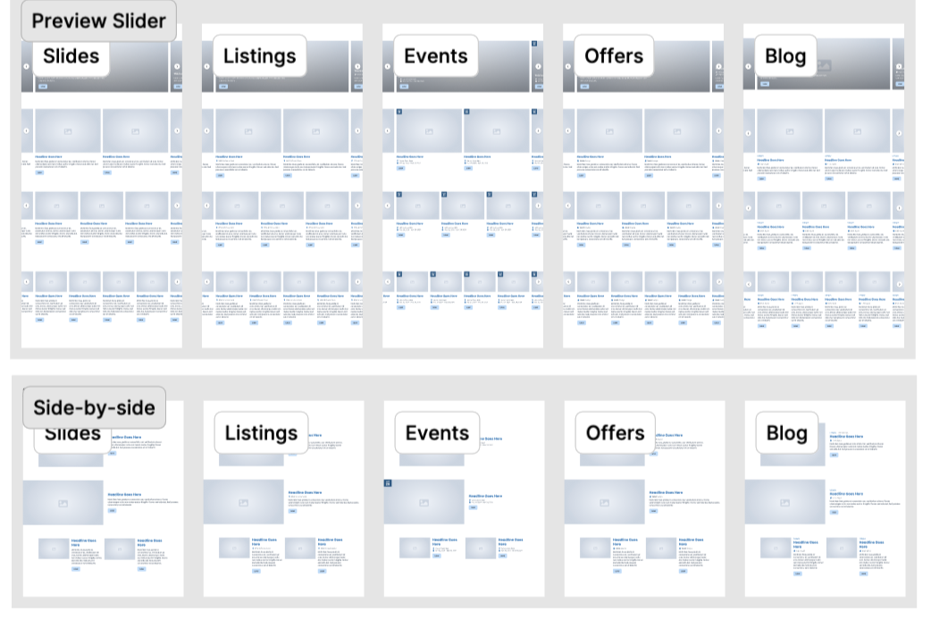
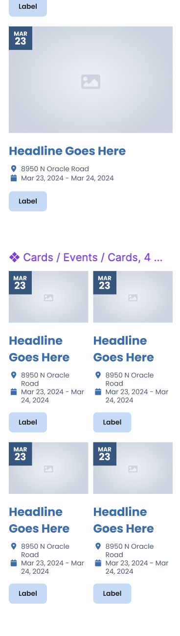
UX Research-Driven Website Modules
Widgets were designed using UX best practices specific to leisure travelers
Hierarchy in content and UI related to the user’s task-based needs
Widgets focused on the leisure traveler’s user journey and task flows

For example, when searching for events on a leisure website, the hierarchy of content is important to how a user needs to see and digest that information. Users will look for things in this order:
When is the event? Date of event is top priority and should sit high in the hierarchy.
What is the event? Does it align with my interests and my group? Event name sits next in hierarchy.
Where is the event located? Is it nearby my accommodations, how will I get there? Location and any specific date ranges fall to the bottom of the hierarchy.
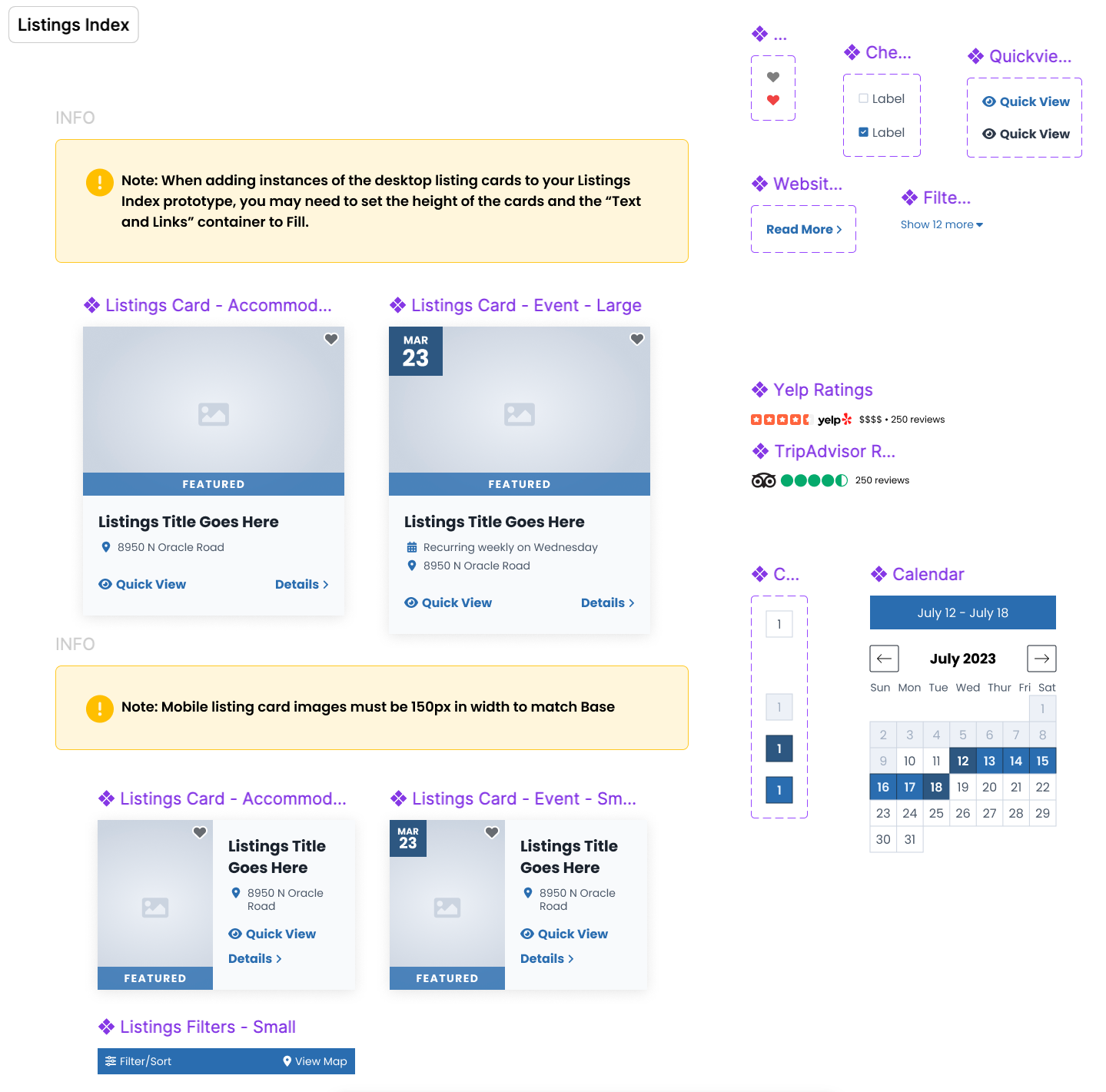
Documentation & Rollout
Centralized system library with clear usage guidelines
Internal workshops for design + dev teams to drive adoption
Governance process for adding new components
Figma library was complemented with a live online library, maintained by the development team, for referencing functionality, interactions and setup in the backend of the CMS
Impact
30% faster project start → development handoff
Major reduction in design inconsistencies & rework
Improved cross-functional alignment & collaboration
Scalable system that supports all future digital projects
Faster turnaround = happier customers = customer retention & referrals