A UX-driven Branding Process Helped Change Perceptions about Atlantic City
Challenge
Atlantic City was one once celebrated as “America’s Playground” where celebrities like Frank Sinatra vacationed. But over time, the destination became more closely associated with gambling, outdated infrastructure, and safety concerns. Our challenge was to shift this perception to showcase the city’s assets beyond casinos and reposition it as a multifaceted destination for leisure travelers, event planners and residents alike.
Role
Design Lead: strategy, stakeholder presentations, design execution, copywriting
Key Outcomes
64.3% boost in positive perception of Atlantic City as a business destination
60.6% increase in meeting planners sourcing AC for an event
91% YOY increase in website traffic
Client signed a second 3-year contract of $1.8m
Atlantic City was up against unfavorable consumer perceptions.
Rebrand Goals
Influence the greater reputation of Atlantic City in the minds of all travelers
Take ownership of Atlantic City's narrative visually, emotionally and verbally
Develop a brand backed by data and visitor insights research
Amplify the most appealing qualities of differentiation and mitigate weaknesses
Develop a fresh and honest identity
Establish Atlantic City as a place to market meetings and events
The Research Phase
Quantitative & qualitative research was conducted to gain insights into Atlantic City as a destination and factors affecting the behaviors, preferences and needs of its target audiences.
17 focus groups
1k surveys
Audiences: Meeting planners, leisure travelers, local residents, community stakeholders
Focus groups rating Atlantic City’s photography and traveler type.
-
High: Local food scene, live music & performing arts, opportunities to relax, water activities
Low: Safety, cleanliness, being in nature, being welcoming & family-friendly
-
High: Waterfront access, sports & outdoor recreation, entertainment & nightlife
Low: Familiarity with clients and attendees, flights & airport lift, safety, lack of “wow” factor
-
• Beaches / Free Access
• Waterfront Bars & Restaurants
• Watersports & Activities
• Historic Boardwalk, Boardwalk Culture, Amusement Piers
• Gambling, Casinos, Live Entertainment & Headliner Events
• Diverse Dining Scene
• A Place to Celebrate Life’s Greatest Moments
-
• A lack of offerings (only casinos)
• Safety concerns
• Cleanliness & maintenance issues
• Perceptions of being out-dated & irrelevant
• Not welcoming or family-friendly
• Airport access & transportation
Research Insights
Click images to enlarge
Examples of the data & findings.
The Brand Development Phase
What did we need to do?…
Counteract the negative perceptions of the city by combining a vibrant aesthetic with positive messaging
Use imagery that depicts the city as clean and welcoming
Showcase activities and attractions outside of gaming/casinos
Build a meetings-first brand centered around the spirited and playful nature of Atlantic City
Positively utilize the brand equity of the destination when marketing to meeting planners and attendees
Establish the link between the city’s offsite leisure activities and their positive effect on team morale, productivity, innovation, and building strong connections
I began to synthesize the insights from the destination immersion and data findings into brand goals and design solutions. In collaboration with Meet AC, the destination’s brand story, pillars and personality traits were developed to guide the brand forward.
Click images to enlarge
SWOT analysis and mapping key attributes and goals to pillars and personality traits.
Brand Story
The brand story was developed as the north star - a narrative that communicates the values, personality, and value proposition, aiming to establish an emotional connection with the audience and create a distinctive brand identity.
We mean business when it comes to hosting an inspiring and memorable event. No matter the time of day, one can channel the city’s energetic spirit to inspire creativity, growth and productivity among teammates, coworkers, and the like. Atlantic City is the perfect place to celebrate the “work hard, play hard” mentality. From the boardroom to the boardwalk, we bring together like-minded, hardworking professionals.
Brand Personality
The Brand Personality reflects the inherent nature, positive qualities and the of voice of Atlantic City. These unique characteristics serve to encourage consistency, guide the tone of voice in messaging and direct the creative decisions made in the production of marketing collateral.
Brand Pillars
The Brand Pillars are the unique touchpoints, values and characteristics that set the foundation of the brand and set it apart from competitors. They align with the values and desires of the audience in order to encourage positive engagement and endorsement of the brand.
Click images to enlarge
Examples of four of the six brand pillars and their content topics to be used in marketing efforts.
Design Ideations
Visual Rationale
A fun and light-hearted aesthetic
Expressive typography, visual elements, and compositions that are spirited and full of life
Wave shapes to create movement, also representing the coastal waters
Colors to be vibrant, exciting and bold
Supporting type has friendly and welcoming, rounded letterforms
Visual Breakdown
Typography is a playful script
Handwritten nature gives it a personal touch
Expressive, alluding to the creative nature of the community
Has personality but is approachable and friendly
Historic signage/ “Name in lights” references
Logo Development
Brand In-use
Show-stopping color, bold typography and inspiring photography along with honed messaging and calls to action were strategically used in combination to pique interest and drive users to the website for both meeting planning and leisure travel.
User Testing
User testing unveiled positive reactions, the need for diversity in photography and increasing logo’s readability
Both meeting planners and leisure travelers were surveyed and interviewed. In total, 310 fully completed surveys were collected in this effort from meeting & event planners from around the country. While short video reactions and surveys were collected for leisure travelers.
Click images to enlarge
Examples of the data & findings.
Design Iterations
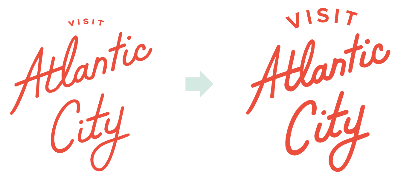
Things to note that came out of stakeholder feedback and creative testing included revising the logo to be more bold and increasing the size type on “Visit” for better readability on smaller applications. The other was to include more diversity in the people represented in the advertisements, which we did have, but did not accurately represent in the specific ads that were used for creative testing.
Results
There were many great stats to pull, but the results I am most proud of are below.
64.3% increase in receptivity that AC is a place for business
60.6% increase in meeting planners sourcing AC for an event
91% YOY increase in website traffic
Client signed a second 3-year contract of $1.8m
dotComm Awards, Gold: Visit Atlantic City, Branding


